My role
UX Designer on the CCAP (Checkout Capabilities) UX team
We offer standardized experiences and screens that can be used in checkouts or across different flows of Mercado Pago.
Impact
- 🧩A single standard for +15 flows
- 🔍3 usability heuristics fixed
- 🤝End-to-end integration workflow
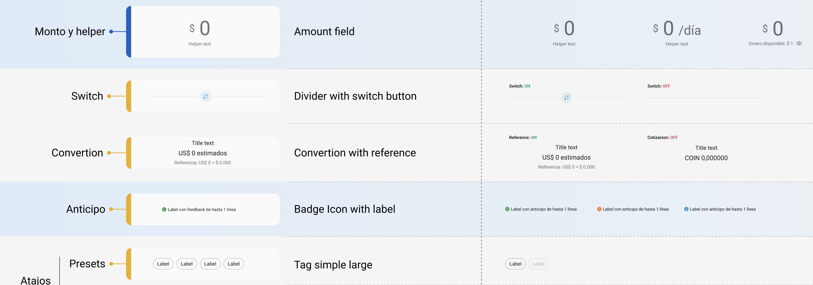
- 📐7 documented, reusable components
- 🚀Guideline ready to scale
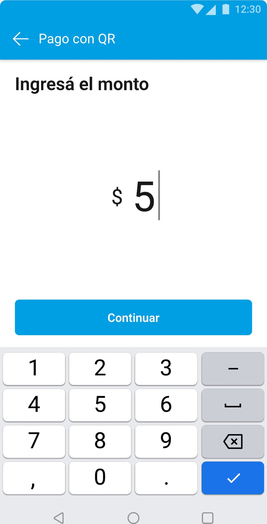
What is the Amount Screen?
It’s the screen where a person enters a monetary amount, whether to complete an operation (like paying for services, transfers, etc.) or to set up a configuration (limits, cost simulations, etc.)
We call it the “Calculator” or the “Amount entry screen.”
Problem
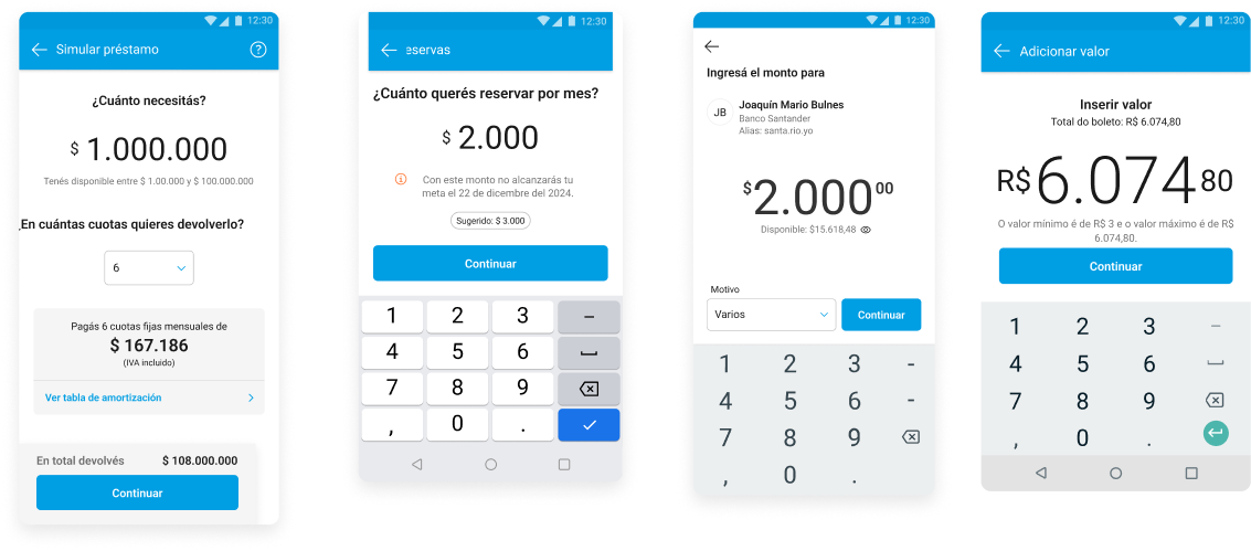
Right now, every Mercado Pago team builds its own Amount Screen. When we audited the screens in production, we found inconsistencies that put the experience at risk and didn’t meet usability heuristics.
Heuristics at stake:
- ✕Consistency and standards
- ✕Recognition rather than recall
- ✕Flexibility and efficiency of use
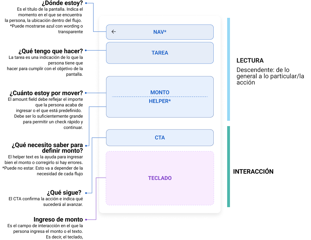
Structure
Components
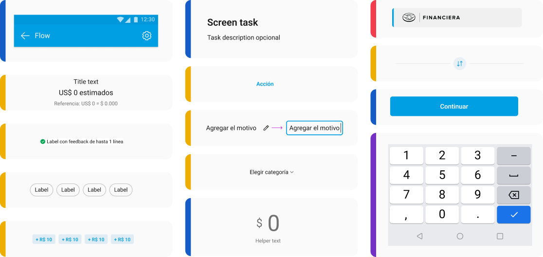
From fragmented screens to a single standard
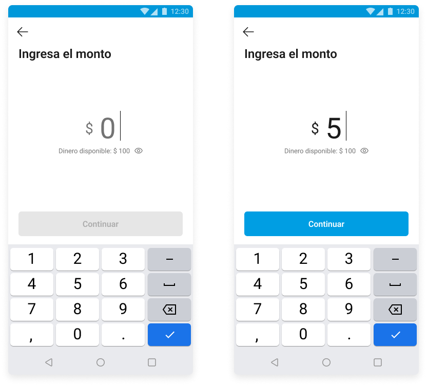
Guideline - Documentation and ongoing support for the project
A closer look at the component’s variations and uses
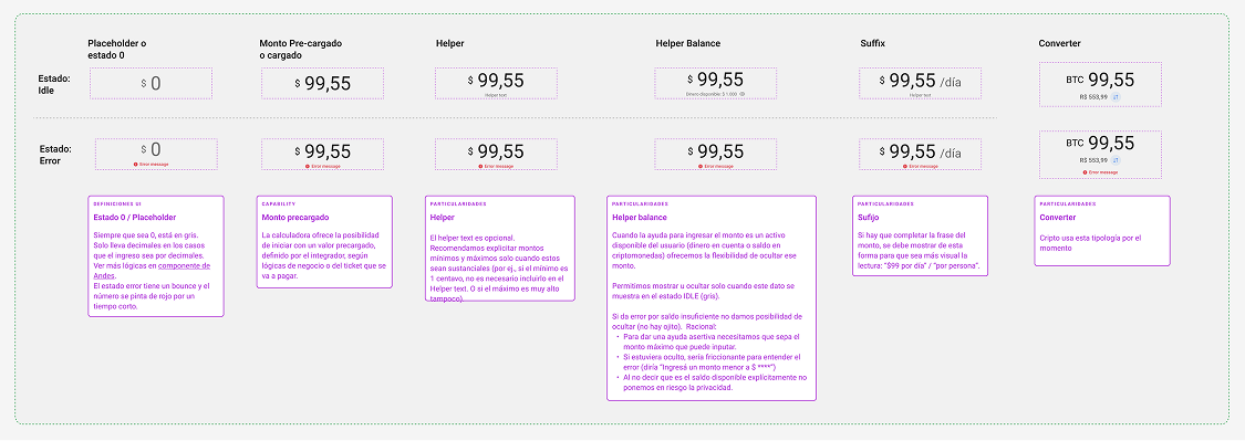
Logic based on filled-in and available values
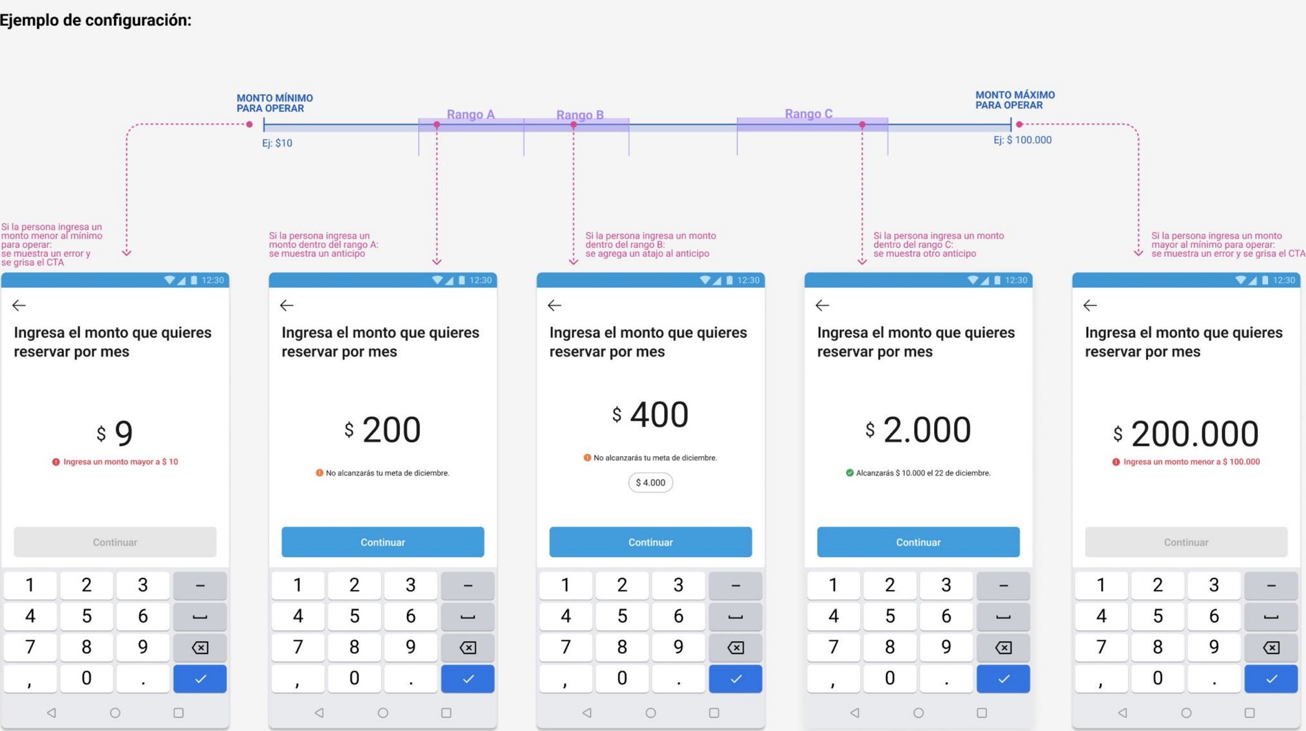
Range validation
The integrating team can configure ranges to define how certain components behave. This makes it possible, for example, to run inline validation on the amount entered in the amount field.
Depending on the range, you can define:
- wording variants for the helper, error message, anticipo, and some complementary actions or shortcuts
- when to show the anticipo or other complementary actions or shortcuts
- when to enable or disable actionable elements
Multiple ranges can also be configured for the same component.
Outcomes
The Amount Screen project standardized a screen that every team used to rebuild their own way, bringing cross-vertical consistency between Sellers and Individuals. The guideline is the direct result of that work: it documents the patterns, reusable components, and integration workflow that support this standardization in any new flow.
- 2 major verticals unified (Sellers & Individuals)
- 7 components documented end-to-end
- 8 workflow steps with defined owners
Accessibility
Unpacking accessibility on the Amount Screen project sparked a series of studies together with Meli’s accessibility team, and it gave us a piece of content
→