Context
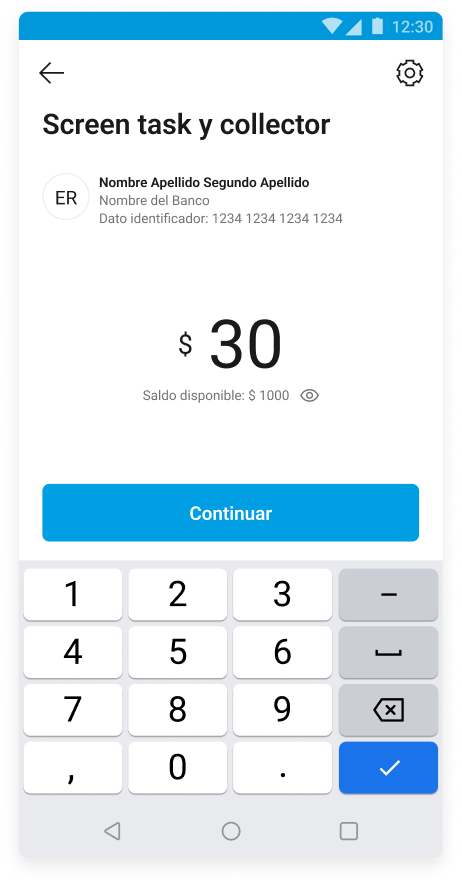
During 2024, the CCAP team worked on improving the Amount Screen
We needed to create cross-team consistency between the teams using this capability
This included, for the first time in a structured way, the accessibility handoff
Challenge
There was no clear accessibility guide for this screen
Different teams implemented it in different ways
Opportunity: turn isolated learning into reusable knowledge
Discovery process about A11Y
A11Y was mentioned a lot, until we understood that from the letter A to the Y, of the English term accessibility, there are 11 letters in between — so we adopted the term.
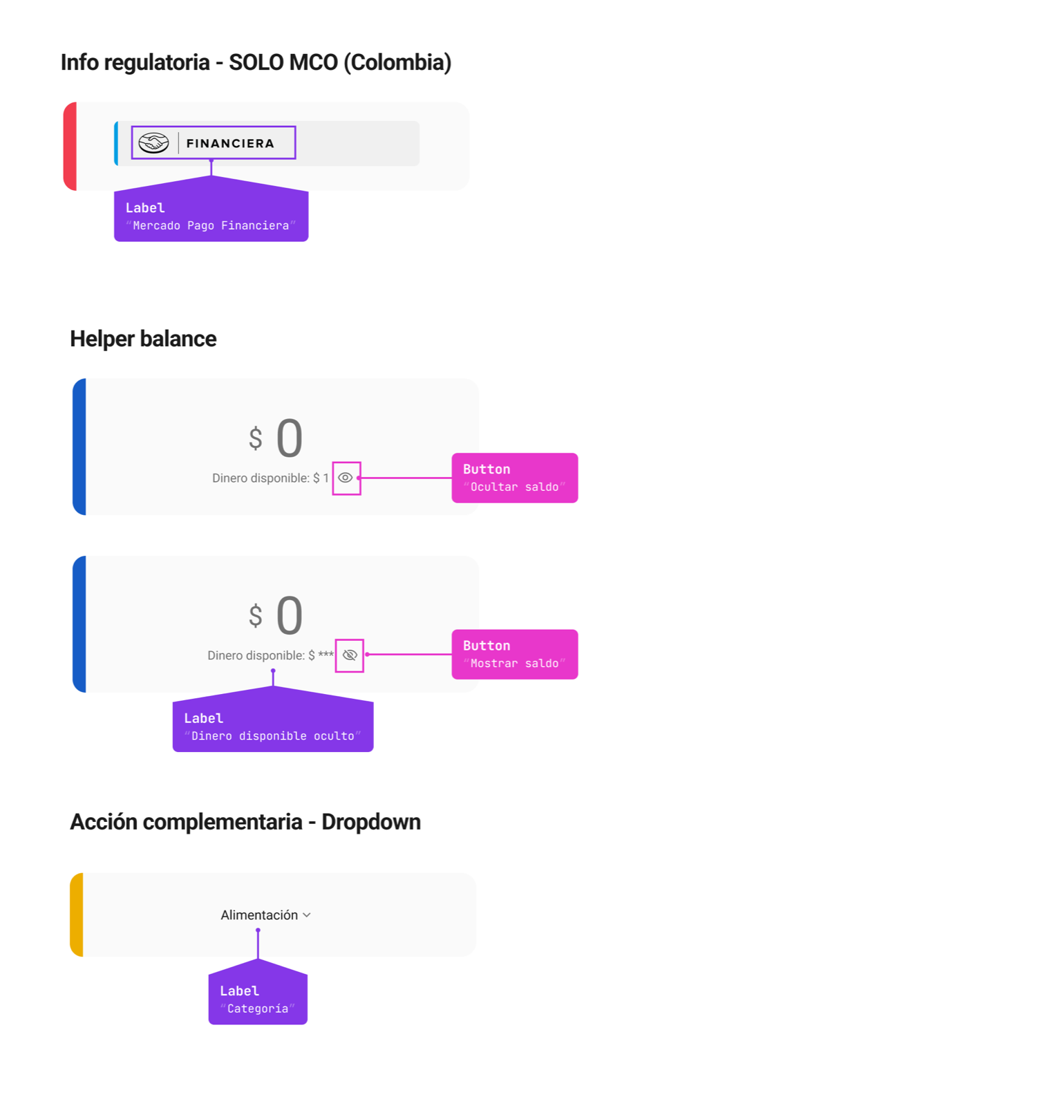
At Mercado Libre, we used to flag in Figma which and how screen-reader readings should happen — a pattern well spread between design and development. However, during validations with accessibility specialists, we changed several things. We learned that not everything needs to be manually flagged (since the Design System already brings native patterns) and that we shouldn’t invent a different journey for screen reader users. It was a discovery-rich process that helped us evolve our documentation.
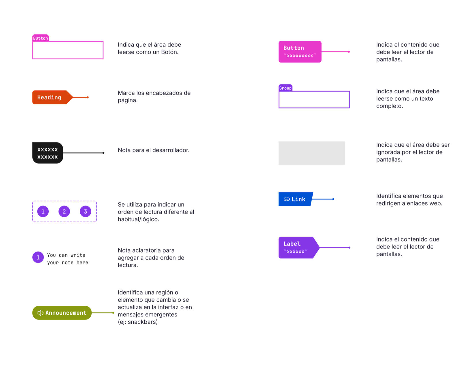
A bit about the handoff:
The 4 Pillars of Learnings
#1: Understanding the reader▾
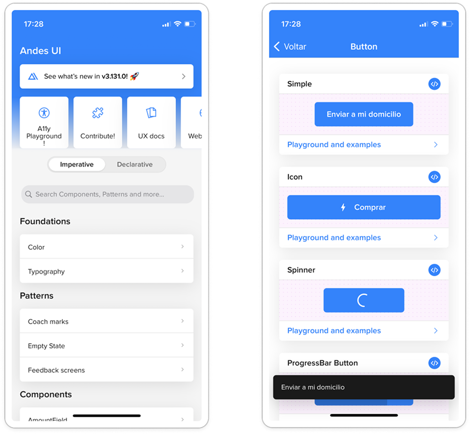
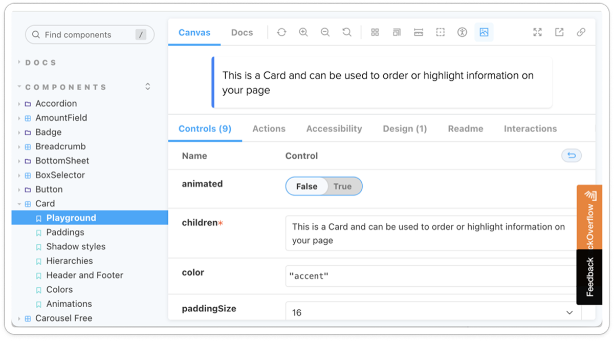
Test production components
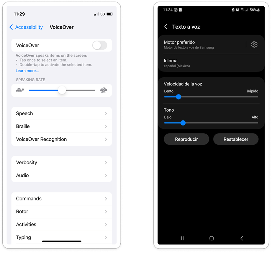
If you’re using components that already exist in the app or are covered in Andes, you can test how they’re read by turning on the screen reader on your phone or opening Fury.
#2: Use what already exists▾
Content coming soon.
#3: Label it right▾
Content coming soon.
#4: Translate labels▾
Content coming soon.
Multiplication
After documenting everything we learned, we realized this knowledge couldn’t stay isolated in our Figma file. We decided to multiply it through three channels:
Internally: We published the guide in Figma and presented it at an accessibility session during the internal “Accessibility Day” (IT Talk)
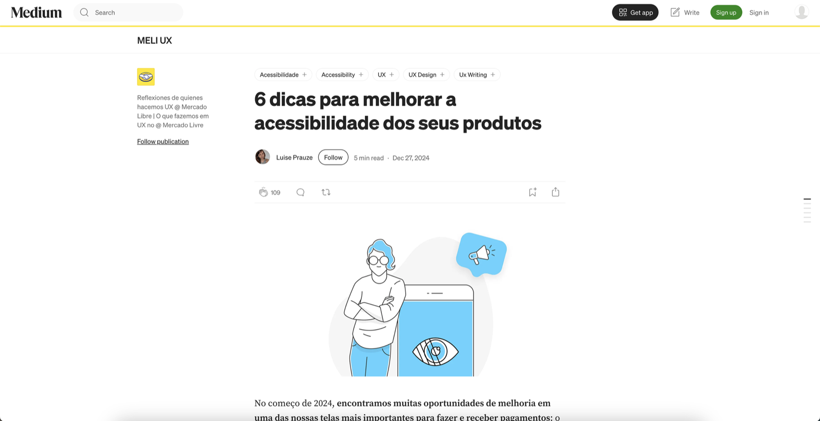
Tech community: We turned the 4 pillars into a Medium post (“6 Tips to Improve Your Products’ Accessibility”) that resonated with people outside Meli. 1K views, 319 reads with a 31% read ratio
Brand: We also shared it on Mercado Libre’s Instagram, positioning accessibility as part of the company’s identity.
PT-BR post “6 Dicas para Melhorar a Acessibilidade dos Seus Produtos”
(Also available in ES: medium.com/mercadolibre-ux/6-tips-para-mejorar-la-accesibilidad-de-tus-productos)
Post metrics:
N/A
Presentations
Times this story was presented across Medium, or via push/email notifications.
1K
Views
Landed on your full story through web, mobile, or email.
319
Reads
Read your story for at least 30 seconds.
Turning a project into shared knowledge doesn’t generate the same kind of “visible impact” as a 30% conversion increase. There’s no pretty graph showing adoption.
The guide lives on in Figma, the Medium post keeps gaining readers every month, and the questions we solved — like how screen readers interpret different components — are the same ones new teams discover.
Impacting people and making that content accessible is the real texture of lasting impact.